Why you don’t need to have the most creativity to create data reports
When my marketing class first breached the topic of working with data analytics, I was admittedly pretty intimidated. And when I saw the website we’d be using to look at data and organize it into reports, I was even more so. Fortunately, I didn’t need to be so worried about figuring out how to use the software. In fact, it wasn’t very hard at all! Working with Google Analytics and Data Studio may seem complicated upon first glance. Despite this, once you have an understanding of what tools are available and where to find everything, creating data reports is fairly simple and doesn’t require much creativity.
How does Data Studio work?
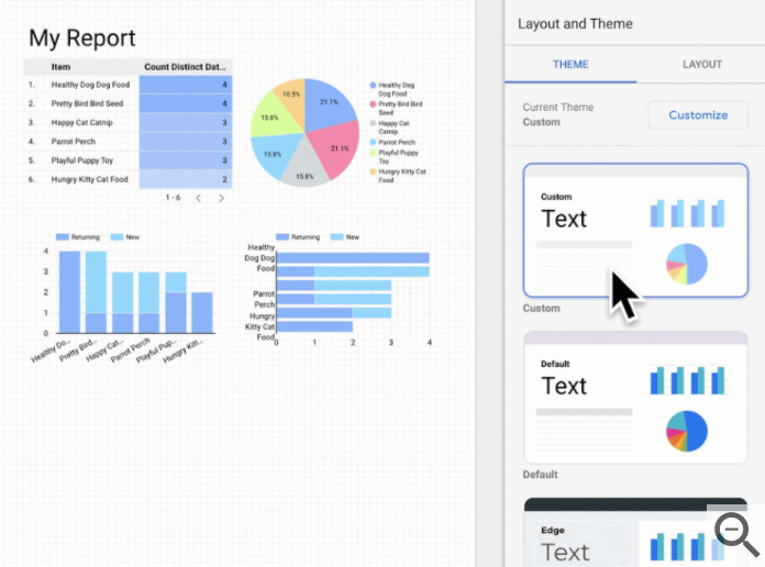
When you open up Data Studio, there is very little you have to do to get started. Once you create a new report, you can easily add data charts or graphs by clicking on the “add data” and “add a chart” buttons near the top, then choosing which type of graph and what data you would like to see. From there, you can change the position and colors of the graphs, and organize them however you like. There are even preset themes you can choose from to make things simpler. Themes can help create a coherent style for your report, making it eye-catching and easy to read- both extremely helpful when trying to communicate information.
Considering the number of tools available on Google Data Studio, creating data reports is perhaps easier than ever. And with all of its built-in features, creativity is only necessary when deciding how to best format your information.